Making infographics using R and Inkscape
I have been making charts with R for almost as long as I have been using R, and with good reason: R is an amazing tool for filtering and visualizing data. With R, and particularly if we use the excellent ggplot2 library, we can go from raw data to compelling visualization in minutes.
But what if we want to give our visualizations an extra kick? What if we want to do some manual retouching? I had long resisted this, thinking that conveying the data was the major concern, and it was up to viewer to parse it how they saw fit. As visualizations become more and more important, it is evident to me that merely conveying the data is not enough; these days, a visualization must also be visually attractive.
With this realization, I started to research how to make infographics and visualizations. This leads quickly to tools like d3.js, which while inarguably useful, are also fairly difficult to use.
I then came upon the concept of retouching charts generated in R using a tool like Adobe Illustrator or Inkscape. Inkscape seems to be less full-featured, but it is free, which is very compelling. I use Linux, so acquiring Inkscape is very simple, and I decided to use Inkscape.
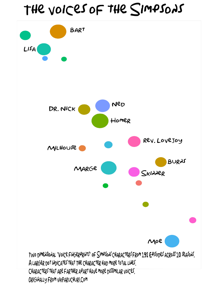
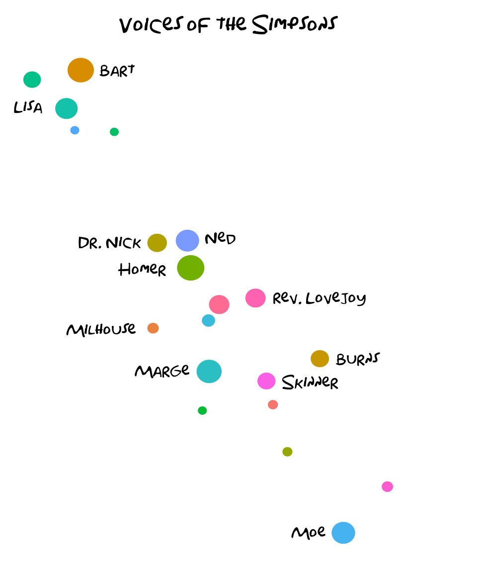
This post will take us from a raw chart exported from R to a finished infographic. The final graphic is below:
Starting out
I generated the charts we will start with using this file in this repo.
It will take a bit of work to get started with, so here is the .eps version of the file if you want.
Here is the .png version of the chart if you want to see how it looks:
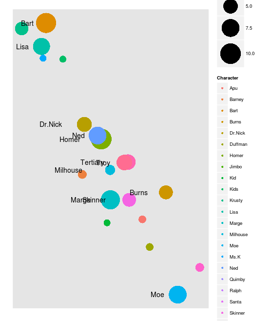 As you can guess from the .eps file extension, the first step is exporting your chart in .eps format. Here is a stackoverflow thread about doing exactly that in R. In Rstudio, the “export” option in the plot dialogue has format selection:

Starting Inkscape
We are now ready to start using Inkscape.
Here are the install instructions for Inkscape. Using Ubuntu, we can type sudo apt-get install inkscape. You can find a basic inkscape tutorial here, and more tutorials are here.
We can now start up inkscape, and choose our .eps file to load.
A dialog will pop up, choose these options (they may already be selected):
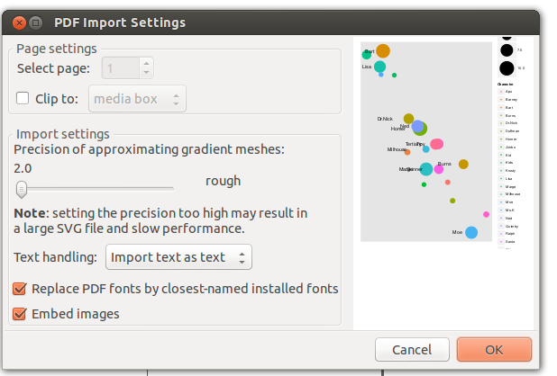 If parts of the image are cut off, you may need to go back to R and export at a higher resolution.
Editing the Image
The first thing we can do is delete all of the text. We can do this by using the textbox tool (F8), and then clicking on the text and deleting.
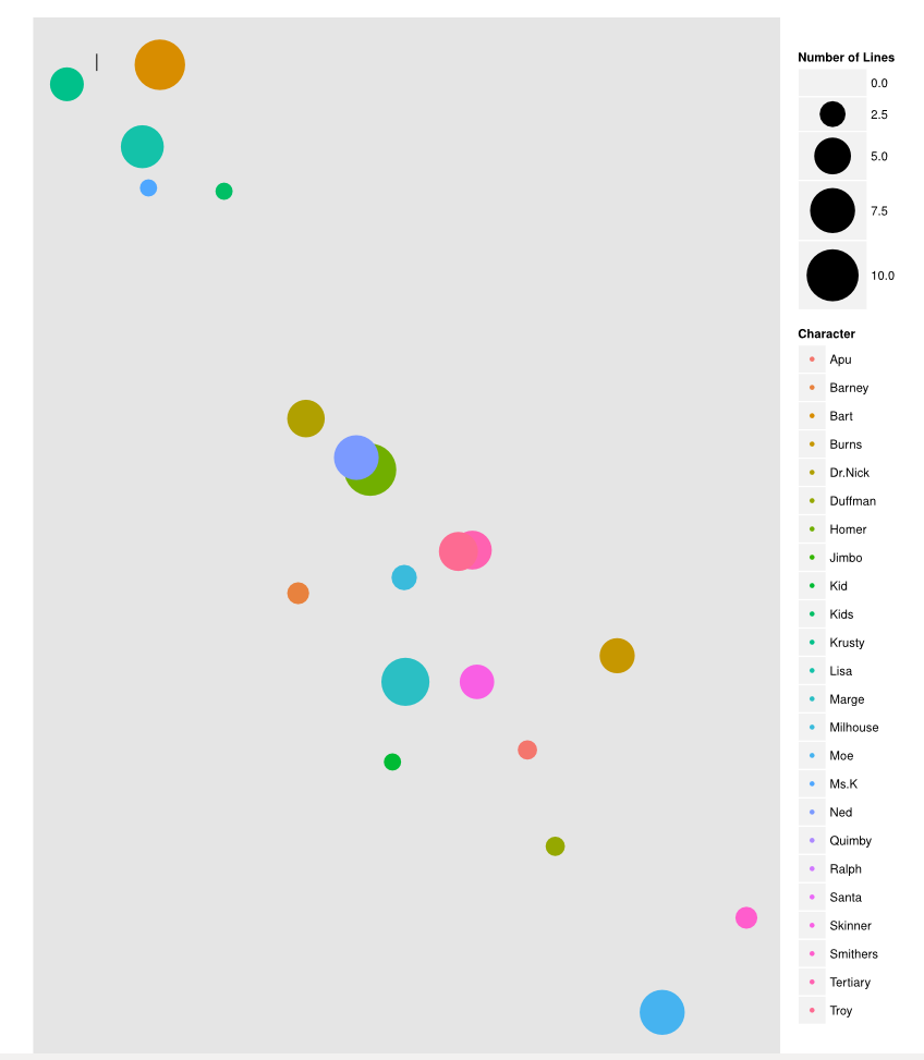 Let’s delete the legends on the right. We can use the selector tool (F1), and then hold shift and click and drag a box around the legend elements. Then hit delete to get rid of all of them.
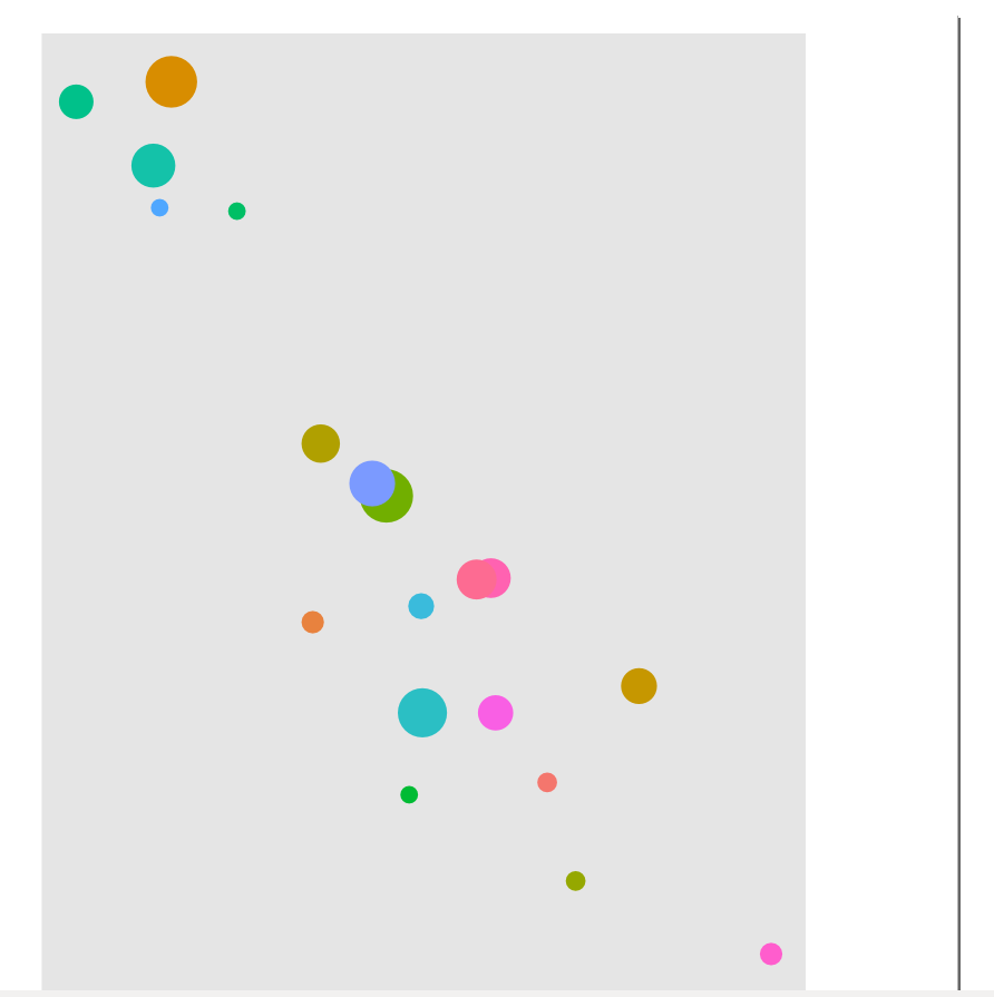 We can move the boxes around to make sure that they don’t overlap. Use the node tool (F2) to select a circle, and then use the select tool (F1) to move it.
Now, let’s ungroup everything. A group in inkscape is treated as a single object when it comes to things like moving and deleting, and we want to delete the gray background. Use the select tool to select the gray box, and then right click and hit “ungroup”. If it works, you will see individual selectors around all of the circles.
Then we can select the background (click somewhere in the gray with the select tool) and delete it with the delete key:
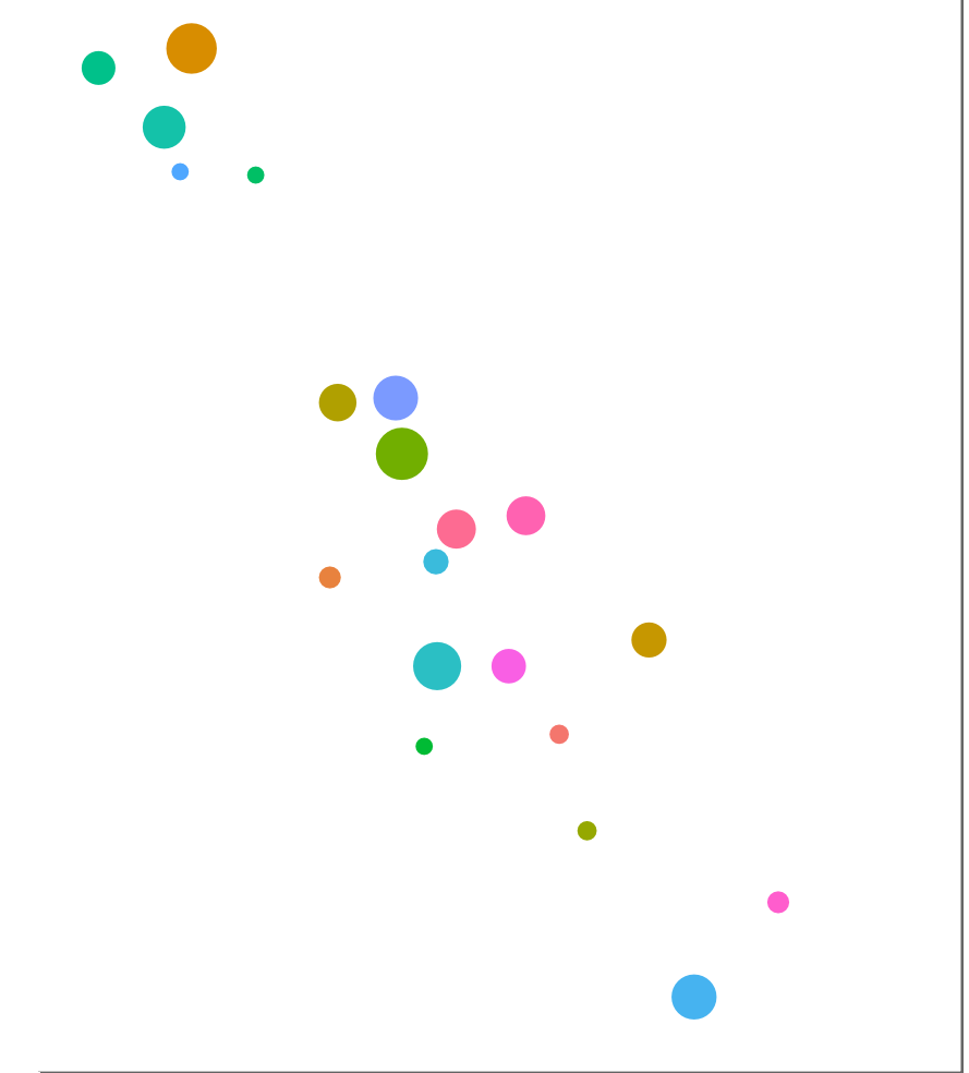 It would be nice to add title text and some text for each of the circles, but it would also be nice if it was a bit unique. Let’s get the simpsons font from here, and follow the inkscape instructions to get it working. You will need to restart inkscape after following the directions.
We can now use the textbox tool (F8) to add textboxes around the circles. Textboxes can be moved using the select tool. We can also change the font size and font in the top left. It may help to make one box, and then use ctrl+d (duplicate) and the select tool to make new boxes and move them to the right spot.
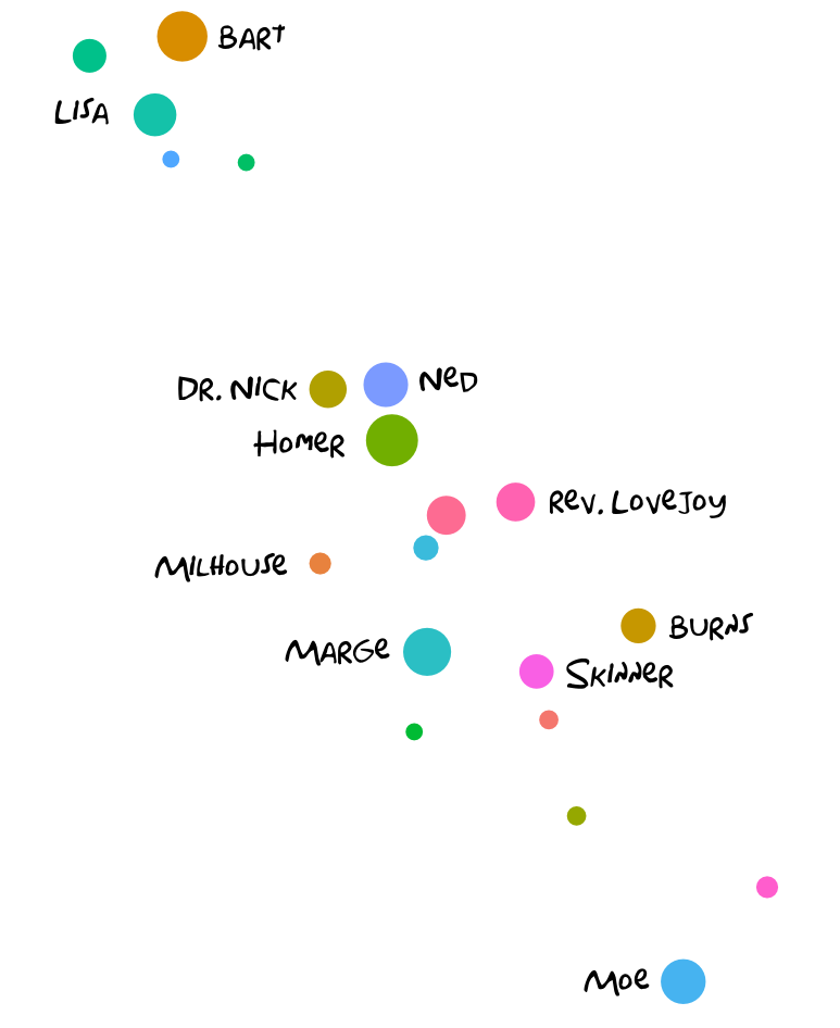 We can add a title using the same principle. Once the title is added, you may notice that what we currently have is taking up the whole canvas. This is mostly due to a white box that surrounds everything.
Let’s get rid of the white box by moving it to a background layer. Use the select tool to click anywhere in the white surrounding the circles. In the menu, click layers –> add layer, and make a background layer:
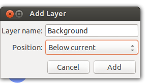 Once this is done, we can click anywhere in the whitespace and resize the image to fit into the page. If you want to move the title box, right click in the white space and hit ungroup to be able to move elements individually.
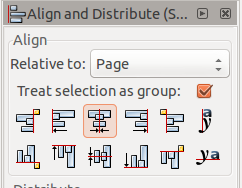
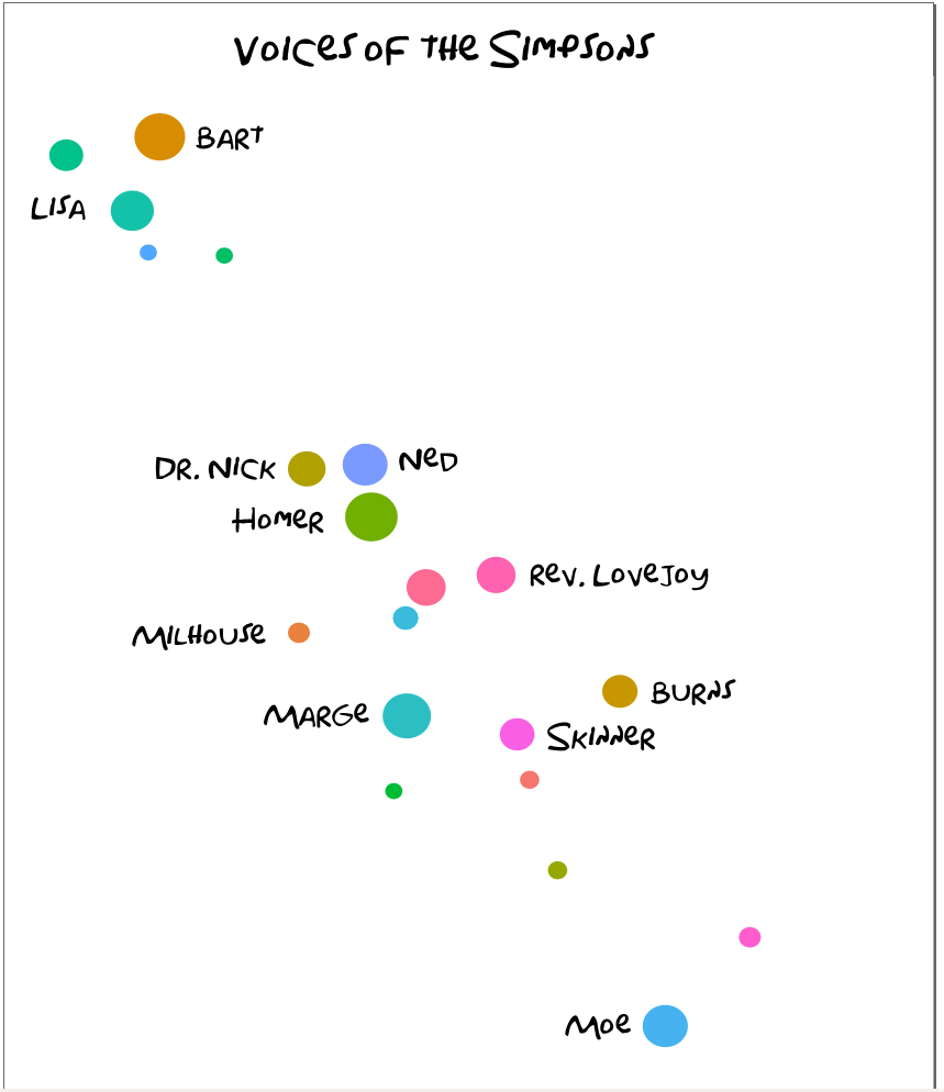 All that’s left is aligning everything. Select all of the elements, and hit
 ctrl+shift+a to bring up the alignment menu on the right. Make sure to treat everything as a group, and select to align vertically.
 Now, we are done. You can export your image as a bitmap using the file menu. If anything appears transparent, you can resize the bottom white box to also be behind the title.
Conclusion
Inkscape can be an incredibly powerful tool when used with R to edit charts. Visually compelling charts are often much more effective than less attractive versions.
